Microseconds and Miles

The following is an unfinished manuscript found under heaps of rubble and pizza boxes here at Virtuosi headquarters. It appears to be some sort of screen play, though one would be hard-pressed to figure this out solely from the script. The true giveaway was the 100 page addendum (not published) full of potential titles and acceptance speeches. I dare not bore you with these vanity pages in their entirety, but just for completeness and posterity I include some samples. For possible titles we have: "Dr. Dre, OR: How I Learned to Stop Worrying and Love the Metric," "How to Teach Physics to your Dee Oh Double G (West Coast Edition)," "Bring Da Ruckus: ODEs by ODB" and "Flavor Flav's Flavor Physics...boooyeeeee!" among other even worse and less relevant titles. Among the acceptance speeches we have one that starts: "I would like to thank the Academy, Scott Bakula and Chuck D. You know what you did. Here's a song I wrote...", etc. It is all very painful. There is almost no value to this document whatsoever, but it does present a nice fun fact about GPS. The legible parts of the script are thus presented below. The illegible parts appear to have been obscured by some caustic mixture of Mountain Dew, pizza sauce and tears. We descend to the bottom of the abandoned mineshaft recently converted to the headquarters of General Stanley K. Ripper. He is currently engaged in a heated discussion with his science advisor, Dr. Vontavious Dre. We join mid-sentence as a result of lazy writing... DR. DRE: ...shortage of scientists! What's that? Yeah, you could definitely call it a "chronic" shortage if you want. But semantics aren't important right now. The "G"-sector needs more funding. GEN. RIPPER: You are my most trusted science advisor, Dr. Dre, but you already have one staff scientist...a Dr. Snoop Dogg, I believe...? How many scientists do we need doing relativity here? This is the military! We need Moonraker lasers and nuclear hand grenades. So no more funding unless... That is, unless you figured out the... DR. DRE: No sir, we still don't have a Stargate. GEN. RIPPER: Well then you are just wasting my time! I want something useful. Either something that goes boom or something that helps something that goes boom. What I don't need is a theoretical money drain. DR. DRE: And how did you find your way to work today, sir? GEN. RIPPER: What? You know very well I ride my horse, Neigh-braham Lincoln. He knows how to get here. DR. DRE: And how does Nifty 'Nabe know where to go...? GEN RIPPER: GPS, of course! DR. DRE: Bingo. That's our department. Without correcting for general relativistic effects (the specialty of the "G"-sector, I may add), GPS would be completely useless. Let me show you. A large blackboard drops down from the ceiling and a slow steady beat, just barely audible, seems to come from all directions. Dre writes the following equation on the board: $$ ds^2 = -\left(1-\frac{R_s}{r} \right)c^2dt^2+ \left( 1 - \frac{R_s}{r} \right)^{-1} dr^2 + r^2 \left( d{\theta}^2 + {\sin\theta} {d\phi}^2 \right)$$ This equation gives the line element for a Schwarzschild metric. The R_s in the equation is called the "Schwarzschild Radius" and is given by $$ R_s = \frac{2GM}{c^2} .$$ GEN RIPPER: Is that Karl Schwarzschild? I remember reading a delightful biography of him somewhere...? Anyway, what the heck is this "line element" thing...? DR. DRE: Good question. Essentially what we get is the differential change in the space-time interval ( ds ) if we change all the coordinates by a very tiny little bit. What is nice about this is that although coordinates are a tricky thing in general relativity and can change from one observer to another, the space-time interval is an invariant quantity. That is, different observers will measure the same space-time interval between events even though they may measure different times and distances. GEN RIPPER: So this space-time interval is just a kind of space-time distance that different observers will agree on? DR. DRE: Right-o. And this invariance allows us to compare different reference frames. Eventually, we will use this invariance to get the frequencies observed by an observer on the surface of the earth and one traveling along with a satellite in orbit. Since we will only be considering observers at fixed radius and fixed theta = 90 degrees (ie at the equator), we can simplify things a bit. Since we will have a fixed radius and theta value we have that: $$ dr = 0 $$ $$ d\theta = 0 $$ and $$\sin\theta = 1 $$ Plugging these simplifications into our line element gives: $$ ds^2 = -\left( 1 - \frac{R_s}{r} \right)c^2 dt^2 + r^2 d\phi^2 $$ GEN RIPPER: Neato Toledo! DR DRE: Right, so now we divide out the -c^2 dt^2 term on the right hand side. So we have: $$ ds^2 = -c^2 dt^2 \left[ \left( 1 - \frac{R_s}{r} \right) - \frac{r^2}{c^2} \frac{d\phi^2}{dt^2} \right] $$ But this is just $$ ds^2 = -c^2 dt^2 \left[ \left( 1 - \frac{R_s}{r} \right) - \frac{r^2}{c^2} {\left(\frac{d\phi}{dt} \right)}^2 \right] $$ But what does that d phi / dt term look like? GEN RIPPER: Sure looks like an angular velocity to me. But don't we need to be careful with these rates? DR. DRE: Yep, that is an angular velocity term. We need to be a little careful with these rates. Essentially, in the coordinate system we have chosen the time is something like the time measured at r = infinity and thus the rate would also be measured from r = infinity. Plugging in omega as our angular velocity, we now have: $$ ds^2 = -c^2 dt^2 \left[ \left( 1 - \frac{R_s}{r} \right) -\left( \frac{r {\omega}}{c} \right)^2 \right] $$ But we want to figure out the times on the GPS satellites, so we'll need some measure of how time ticks by as measured by the orbiting observer. In the rest frame of the observer, we have that $$ ds^2 = -c^2 {d\tau}^2 $$ where the tau is the "proper time" of the observer. It tells us the time that the observer measures on his clocks. To find the frequency (in other words, how quickly the observer clock ticks by a second) we just have $$ f = \frac{1}{d\tau} $$ And now we have enough background to start talking about GPS! GEN RIPPER: Hooray! Should I go get my horse...? DR. DRE: I don't think that's necessary...? Anyway, let's model our GPS system as a satellite in a 26,000 km orbit [1]. Meanwhile our earth reference frame will be an observer standing on the surface of the earth. So let's write out our line element for each reference frame. First the satellite frame: As Dr. Dre works, the beat steadily gets louder. $$ ds^2 = -c^2 {dt}^2 \left[ \left( 1 - \frac{R_s}{R_{sat}} \right) -{\left( \frac{\omega_{sat} R_{sat}}{c} \right)}^2 \right] $$ So the frequency at which a satellite clock ticks is $$ f_{sat} = \frac{1}{dt} \left[ \left( 1 - \frac{R_s}{R_{sat}} \right) -{\left(\frac{\omega_{sat} R_{sat}}{c} \right)}^2 \right]}^{-1/2} $$ and likewise the earth frame: $$ ds^2 = -c^2 {dt}^2 \left[ \left( 1 - \frac{R_s}{R_{earth}} \right) -{\left(\frac{\omega_{earth} R_{earth}}{c} \right)}^2 \right] $$ So the frequency at which an earth clock ticks is $$ f_{earth} = \frac{1}{dt} \left[ \left( 1 - \frac{R_s}{R_{earth}} \right) -{\left( \frac{\omega_{earth} R_{earth}}{c} \right)}^2 \right]}^{-1/2} $$ Taking the ratio of these frequencies tells us how quickly the satellite clocks tick relative to the earth clocks. We get: $$ \frac{f_{sat}}{f_{earth}} = {\left[ \frac{\left( 1 - \frac{R_s}{R_{earth}} \right) -{\left( \frac{\omega_{earth} R_{earth}}{c} \right)}^2 }{\left( 1 - \frac{R_s}{R_{sat}} \right) -{\left( \frac{\omega_{sat} R_{sat}}{c} \right)}^2 } \right]}^{1/2} $$ And we're done. So what do we get? Let's plug in some numbers: $$ r_{sat} = 26 \times 10^6 m $$ $$ R_{earth} = 6.3 \times 10^6 m$$ $$\omega_{earth} = 7.3 \times 10^{-5} rad/s $$ $$\omega_{sat}=\sqrt{\frac{GM}{{r_{sat}}^3}}=15 \times 10^{-5} rad/s $$ $$ c = 3 \times 10^8 m/s $$ We can also find the Schwarzschild radius of the Earth to be $$ R_s = 8.9 mm $$ Now you still have that fancy calculator, right General? Can you plug all this stuff in there and tell me what you get? General Ripper works diligently on the calculator for a few minutes, then shows the calculator to Dr. Dre. DR. DRE: "01134"..? No that can't be correct. Did you plug in the values I ... ? General, with a wry smile, turns the calculator upside down and shows Dr. Dre. DR. DRE: Ah, well "hello" to you to sir. GEN. RIPPER: And I've got another! Now where's that eight key...? DR. DRE: I guess I'll just do the math in my head... The background beat, which had just reached a crescendo immediately drops out as Dre thinks. Then comes right back in as he begins to speak again... Alright, I got that $$\frac{f_{sat}}{f_{earth}} = 1 + 4.4 \times 10^{-10} $$ From this we see that the satellite clock ticks faster (i.e. at a higher frequency) than does the earth clock. The difference is very very small. For every second that ticks by on earth, we see that the difference in the earth and satellite clocks increases by 4.4 * 10^{-10} seconds. GEN RIPPER: But we are talking about half a billionth of a second! There's no way that can do much harm. DR. DRE: Well remember, that's per second. So over the course of a day (86,400 s), the satellite has picked up 38 microseconds. But that corresponds to $$ d = c \times t = ( 3 \times 10^8 m/s ) \times ( 38 \times 10^{-6} s ) = 11 km $$ So without correcting for general relativity, GPS systems would be off by 11 km per day! GEN RIPPER: I am impressed! Here's millions of dollars in funding! Hooray! DR. DRE: Hooray! Dr. Dre and General Ripper jump up and give each other a mid-air high five. We freeze-frame this scene and"Don't You Forget About Me" plays as the credits roll. THE END (?) [1] Thanks to Tom from Swans on Tea (one of my favorite physics blogs) for fixing a mistake for me. I had initially done the calculation assuming the satellite was in a geosynchronous orbit (about 42,000 km) and got a time delay of 48 microseconds. As it turns out, the GPS satellites are really at an orbit of about 26,000 km, which gives a time delay of 38 microseconds. I have made the appropriate changes and the calculations now reflect this more accurate value. **

Paradigm Shifts 1

Hi everybody, I'm Sam, and this will be my first contribution to the blog! (cue applause) It will not be a physical modeling exercise; instead I will be writing a little bit about about paradigm shifts in a series of a few posts. I hope it will provoke some interesting discussion. "But Sam," you ask, "Isn't 'paradigm shift' just a buzzword that people use to sound important?" Well, maybe, but it's also useful phrase used to describe a substantial change in the way something is done. Consider, for example, THE METRIC SYSTEM (many details from Wikipedia) image In 1791, in the wake of revolution, France became the first country to adopt the recently developed metric system. Since then, every nation in the world has officially adopted the metric system except Liberia, Burma, and the United States. It is the standard measurement system for most physical science, even in the US (as far as I know, no other unit system even has a measurement for quantities like electric field or magnetic field) (also, when I say metric, I of course include cgs and mks and ignore systems that are not meant for measurement, like natural units and Planck units). It has the advantages of easy unit conversion (1 km = 1000 m vs 1 mile = 5280 ft, a value which I had to look up from Yariv's post), and lack of ambiguity in units (mass = kg, force = N vs mass = lbs_mass or stones, force = lbs_force). The strong preference of scientists for the metric system is evident from past experiences: From CNN, September 1999: "NASA lost a $125 million Mars orbiter because a Lockheed Martin engineering team used English units of measurement while the agency's team used the more conventional metric system for a key spacecraft operation" This story also illustrates the equally strong preference of engineers for the English system. Ah, and herein lies the problem. You see, when the metric system was first adopted in Europe, it created a standardized unit system. This proved useful to merchants selling their wares by weight, but more relevant to myself as a scientist, it provided a means for creating scientific recipes, for providing the utterly essential aspect of reproducibility to scientific experiments. However, now the standardization exists even with the English system, given a simple unit conversion. But why not adopt the metric system to avoid situations like the Mars orbiter and make me less confused when I cross the border to Canada and see speed limit signs telling me to do 80? Because it would be too huge of a paradigm shift. Allow me to illustrate my point. One of the most (if not the most) strongly affected groups by a change in measurement systems is manufacturers, ie people who make stuff. I will use a typical example of a manufacturer, the kind who I interact with in my lab: the noble machinist (keep in mind that machinists are very important, as they are required to make many, many products). If you have ever worked with a machinist in the states, chances are he or she will be totally confused if you try to give them dimensions in millimeters (I have done this, and they weren't very happy with me because it meant they had to convert all the dimensions I gave them into English). It would be extremely difficult to retrain people who have used the English system all their lives. It would be like learning a new language. Inevitably, it would cause a large number of mistakes. More significantly, they would have to get ENTIRELY new equipment. Every machine shop would have to completely replace their tools (drill bits, screwdrivers, wrenches etc) and materials (standardized sizes of bolts, nuts, sheet and bulk material, pipes, connectors, cables, etc etc). You could say, "Come on, it wouldn't be so bad! Listen, we could gradually phase out the old English equipment and just make everything in metric from now on!" However, I would counter that this is not a realistic plan. For starters, there's the problem of having to keep around two sets of equipment (one for the old English stuff and one for the new metric stuff), which would require double the space and double the maintenance. Second, there would be compatibility issues between new and old equipment (e.g. my old 3/4" ipod port wouldn't mate with my new 2 cm connector). Third, the previous two problems would likely be around for a long time, considering the age of some of the equipment that I've seen in labs and elsewhere. And I haven't even mentioned the economics. If basic parts manufacturers (the people who make the screws, the bolts, and the sheet metal that will later be made into products) began to offer metric parts (now that I think about it, maybe they already do?), I doubt anybody would buy them. It would cost them too much to replace all their machinery infrastructure. There would be no market for them. Maybe you would then ask "Well, what if the government made everybody switch to metric?" Well, other than the backlash this would cause towards whichever administration suggested this, it would likely hurt and maybe even bankrupt companies who were forced to switch. As far as I can tell, it would definitely hurt the US economy in the short term (but it might help other countries who could sell their metric wares here) and not help it at all in the long term. To me, the economic loss (not to mention the difficulty in convincing the US population to swallow the change) outweighs the advantages of switching. At this point, exhausted from my challenging you at every turn, you may finally say, "Well hey, SPEAKING of Canada, they changed to the metric system only in 1973. How did THEY do it??" The answer is that, well, they didn't. Not entirely anyway. Sure, the country may package food and make road signs in metric (which the US could probably do, if people could somehow be convinced to go along with it), but in fact their engineering materials, which mostly come from the states, are still in English units. Even Canada couldn't justify completely converting to the metric system Which just goes to show how difficult it is to pull off a paradigm shift. Next time, I'll present an example of a paradigm shift that I think COULD work.

Remembering two things

One of my professors, Yuval Grossman, was talking about the zoology of particle physics in class the other day. Trying to get us to remember such trivia as the mass of the B meson, he noted that it's easier to remember two things than it is to remember one - and as it happens, the mass of the B meson is about 5280 MeV, which is also the length of a mile in feet (an equally obscure piece of trivia, if you ask me). This reminded of one of my first calculus classes back home where another professor (Mikhail Sodin) chided us for not knowing the value of e, 2.71828. This is easy to remember, he said because 1828 is the year Lev Tolstoy was born. Then again, when I came to write this post, I could neither remember e, nor Tolstoy's year of birth - or even that it was Tolstoy, rather than Dostoevsky or some other Russian author. So perhaps two things are not easier to remember than one after all.

Caught In The Rain

image There's an age old question that mankind has pondered. I'm sure that noble heads such as Aristotle, Newton, and Einstein have pondered it. I myself have raised it a few times. The question is: do you get more wet running or walking through the rain? Now, I know that this question was mythbusted a while back. So this is one of those situations where I know the result I want to get to with my calculation: according to mythbusters running is better. Still, I think formulating the question mathematically will be fun, plus if I fail to agree with experiment everyone can mock me mercilessly. I'll begin by stating a few assumptions. I'm going to assuming that the rain is falling straight down, at a constant rate. I'm also going to assume that if we are standing still, only our head and shoulders get wet, not our front or back. With those in place, lets start by formulating the expression for how wet we would get if we stood still. Well, take $$\Delta W_{top} - \text{the change in water (in liters) on a person} $$ $$\rho - \text{the density of water in the air in liters per cubic meter}$$ $$A_t - \text{top area of a person}$$ $$\Delta t - \text{time elapsed}$$ Intuition suggests that the rate at which raindrops hit our top, times the area of our top, times the time we stand in the rain, will give us the change in water. In an equation, $$ \Delta W_{top} = \rho A_t v_r \Delta t $$ Note that whatever expression we generate for how wet we get when moving will have to reduce to this form in the limit that we're not moving. This will be a good check for us. Next, we need to define a few additional measures: $$d - \text{distance we have to travel in the rain}$$ $$v_r - \text{raindrop velocity}$$ $$A_f - \text{front area of a person}$$ $$W_{tot} - \text{total amount of water in liters we get hit with} $$ Well, no mater how fast we run the rain will keep hitting us on the top of our heads, so we're going to have our standing still term, plus another term for how much hits us when running. How do we consider that? Well, when we run, we're cutting into the swath of rainy air in front of ourselves. We'll get hit on our frontside by all the additional raindrops in that stretch we carve out. Mathematically, if we travel some distance delta x in a time delta t, we'll get hit with an additional amount of water $$ \Delta W = \rho A_f \Delta x $$ $$ \Delta W = \rho A_f v \Delta t $$ We combine our two terms to get $$\Delta W_{tot} = \rho \Delta t (A_t v_r + A_f v)$$ Note that if we stop walking (v goes to zero) we'll return to our stationary expression. Next I'll take the delta t over to the other side, turn that into a derivative, and integrate to get the total water hitting us, not just the change for some delta t. Of course, since everything else in the equation is constant, this is the equivalent of dropping the deltas, $$W_{tot} = \rho (A_t v_r + A_f v) t $$ $$W_{tot} = \rho (A_t v_r + A_f v)\frac{d}{v}$$ $$W_{tot}= \rho d (A_t \frac{v_r}{v} + A_f)$$ where I substituted t = d/v, and did some simplification. Now, lets look at the qualitative features of this result. First, we have two terms, a constant and a term that depends inversely on the velocity of motion. This means that the faster we go, the less wet we get (I'll plot this in a bit), but also that there's a threshold wetness you cannot avoid. This threshold represents the amount of rain in a human sized channel between where you start and where you end. Also note that as velocity goes to zero, i.e. we stop moving, how wet we get goes to infinity. That is, if we're going to stand in the rain forever we're going to keep getting wet. What is the term in 1/v? It's the amount of rain that hits you on the top of your head! So what we've derived is that for a fixed distance how wet you get on the front is fixed, and by moving faster you can make less rain hit you on the top of your head. Now, lets figure out what some reasonable numbers are, and plot this function. A few months back when discussion human radiation I estimated my area as a cylinder with a height of 1.8 m and a radius of .14 m. This gives a top area of A_t = .06 m^2 and a front cross section area (note, this is not the cylinder area, but my cross section that will be exposed to the rain!) of .5 m^2. As for raindrop velocity, well in my first post on this blog I calculated the terminal velocity of what I described as a medium sized raindrop as 6 m/s, and since water drops reach that while going over niagara falls, we can assume that our raindrops are falling at terminal velocity. Finally, I need to estimate the water density. In a medium-to-heavy rain I would say it takes about 45 s to get a sidewalk square totally wet. Let's assume a raindrop wets an area of sidewalk equal to twice the cross section of the raindrop. I used a raindrop of 1.5mm radius, so that's 710^-6 m^2 cross section. Now, a sidewalk square is about 2/3 m x 2/3m (about 2 ft x 2ft), so we need \~32000 drops! The volume of a 1.5mm drop is 1.4^-8 m^3, so we have a volume of 4.510^-4 m^3 = .45 liters. Now, take our stationary expression from above. This allows us to solve for \rho. Set delta W equal to .45 liters and substitute the rest of the numbers we've generated. $$ \frac{\Delta W_{top}}{A_t v_r \Delta t}= \rho $$ $$ \rho = \frac{.45 liters}{(.44 m^2)( 6 m/s )(45 s)} = .004 liters/m^3 $$ We've found our water density, .004 liters/m^3. Having done this, we can plug numbers into our final equation above and find $$W_{tot}= d (\frac{(.001 liters/s)}{v} + .002 liters/m)$$ This scales linearly with distance, so lets pick something reasonable, say 100m, and if you want the result for another other distance just scale the results appropriately. Thus $$W_{tot}= (\frac{(.1 liters\text{*}m/s)}{v} + .2 liters)$$ Finally we can plot this.


image Plot of how wet you get vs. how fast you run. The blue line is the actual curve and the red line is the theoretical least wet asymptote.


I've chosen .5 m/s (\~1mph, a meander) and 11 m/s (slightly faster than the world record for the 100m dash) as my starting and ending points on the velocity. The blue line is the curve I calculated, and the red line represents the theoretical minimum, the 'wetness threshold' if you will. So you see that if you are Usain Bolt, you can reduce how wet you get by almost a factor of two by going from a meander to a sprint! Now, there's more I could say about this (what if the rain isn't coming straight down? What is my best speed if I have an umbrella?), but I think that's enough for tonight. I've come out with a theoretically satisfying result that concurs with experiment. Anytime that happens that's a good day for the theorists.

Ringing A Bridge


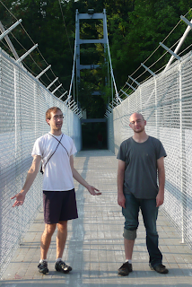
image Matt and Jared standing on our experiment


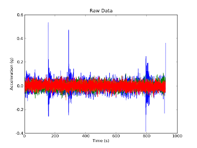
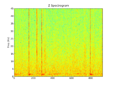
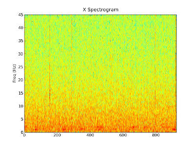
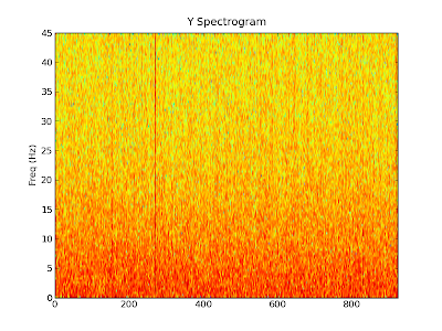
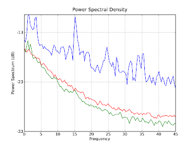
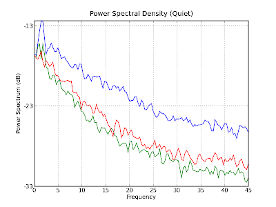
When you strike a bell, it rings at a given frequency. This frequency is called the resonant frequency and is the natural frequency at which the bell likes to ring. Just about anything that can shake, rattle, or oscillate will have a resonant frequency. Things like quartz crystals, wine glasses, and suspension bridges all have a resonant frequency. The quartz crystals oscillate at frequencies high enough for accurate timekeeping in watches, the wine glasses at audible frequencies to make boring dinners more interesting, and bridges at low enough frequencies that you can feel it when you walk. It is the resonant frequency of bridges that we decided to measure. To make our measurements, we "borrowed" Yariv's fancy phone. One of the nice things about fancy new phones is that most of them have internal accelerometers to detect motion. You can do a whole bunch of fun experiments and take some pretty good data with these accelerometers (see, for example, physicist and TV star Rhett Allain's posts over at dot physics). Placing Yariv's phone on the suspension footbridge on campus, Alemi, Matt and I took data and confused passers-by for about 15 minutes. The accelerometer in the phone measures acceleration in three coordinate directions: x is along the width of the bridge, y is along the length of the bridge, and z is up and down. The raw data is shown below. The z data is shown in blue, and x and y in green and red. image The first thing you'll notice about this data is that the z direction (blue) has big spikes in it around 180s, 300s, and 800s. The biggest spikes are when Alemi and I jumped up and down to ring the bridge. The smaller bumps in the blue data are the result of people walking or jogging by. With the raw acceleration data and knowledge of the sample rate of the accelerometer ( 90 Hz ), we can Fourier transform it to get frequencies. Doing this to the raw data for each dimension we get the following spectrograms. Each of the spectrograms illustrates how much of each frequency is present at each point in time. The most relevant direction for us is the z direction. We see that at several points there are strong signals at all frequencies followed by longer periods where the main signal is around 1 Hz. These events correspond to when Alemi and I jumped up and down and are analogous to ringing a bell. The striking of the bell is just a sharp impulse (roughly a delta function) which is composed of all frequencies. Soon after the impulse, all of the frequencies die out except for the resonant frequency, which keeps on ringing. Just looking at this graph, it looks like the bridge resonant frequency is around 1 Hz. image We can also make similar graphs for the x and y directions. Remember, the x direction is the width of the bridge and the y direction is the length of the bridge. Although there is less motion in these directions, the spikes where we jumped and people walked by are still clearly visible. image image Finally, we can find out how much of a particular frequency is in the whole signal. To do this we take find the power spectrum density of the entire data set (blue is z, green is x and red is y). The ringdown frequency of about 1 Hz we saw in the spectrograms above after the jumps is illustrated in this graph as the first blue peak. There are also some other peaks at around 15 Hz, 25 Hz and 35 Hz. I am not sure what they correspond to. image To clean up this a bit, we can just take the data without the jumps in it. Computing a new power spectrum density with just the data from about 400s - 700s, we get the following graph, which also displays a fairly prominent peak around 1 Hz. image So it seems that there is definitely something going on around 1 Hz. Initially, I was worried that this is just the rate at which people walk and therefore it was just showing up because we had people walking the whole time. However, the strong 1 Hz signal after each ringing in each z spectrogram seems to indicate that it is intrinsic to the bridge. Therefore, it seems as though the resonant frequency in the z direction of the bridge is about 1 Hz. But don't take our word for it. If you want to do your own analysis, you can find the raw data here.

Terminal Velocity 2: A Theorist's Experimental Experiment

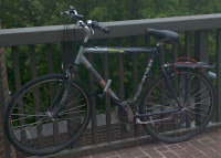
Yesterday we rode down Ithaca's hills in an attempt to estimate the terminal velocity of a bike rider braving the city's potholes. But estimations are easy, and we relied on a number of factors - the drag coefficient and area of the bicyclist, in particular - to get them. To see how well we did, it's time to move on to the experimental portion this exercise. Our tools? My bike (figure 1), and my beloved accelerometer (figure 2), with Google's My Tracks app installed.

imageFigure 1: Our vehicle

image

Figure 2: Our instrumentation

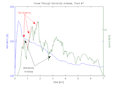
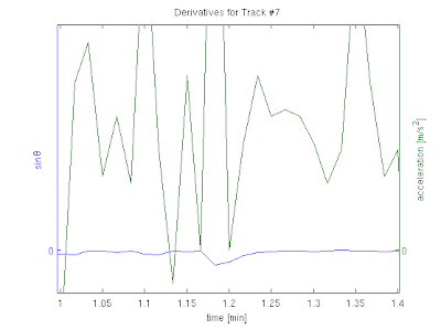
I took data twelve times while driving down two paths (University avenue and State street), measuring both the speed and elevation as a function of time. I came up with a lot of noisy data, some of it useful and a lot of it not. A typical plot out of the software looks something like (figure 3); out of those I identified moments of what seemed to be free acceleration, where I was not applying the brakes. I then calculated the slope and the acceleration at each point by subtracting subsequent measurements; this resulted in much noisier data, as seen on (figure 4).

imageFigure 3: Typical data riding downhill imageFigure 4: Derivatives

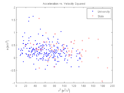
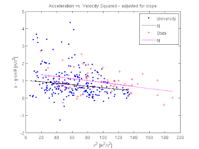
The next question was what to fit these graphs to. I can't compare directly to the formula I had for terminal velocity, since I don't believe I achieve it at any point and we never see the velocity graph plateau. What we do have is the formula for the acceleration, which depends on both the angle and the velocity: $$ a = g\sin\theta - \frac{1}{2}\frac{\rho A C_d}{m} v^2. $$ It's a little hard to plot three-dimensional surfaces like this, but I can try to plot the acceleration as a function of the velocity squared. Assuming that the slope of each of my routes is constant and that they are both different, this should give me two straight lines offset by a constant. Seen in (figure 5), this yields less than optimal result. A first correction would be to account for the differing slope at different measurement points. Once we do that the data looks a little more linear, and we can fit a line through it, as seen in (figure 6).

imageFigure 5: Acceleration vs. velocity

imageFigure 6: Adjusted for slope and fitted

The fits are given by: $$ a = (1.022 \rm{m}) - (0.00427 \rm{1/m}) v^2\;\; \rm{(University)} $$ $$ a = (1.465 \rm{m}) - (0.00572 \rm{1/m}) v^2\;\; \rm{(State)} $$ and we can quickly extract the terminal velocity out of the coefficients to get a factor of 47.9 m/s for the first line and 41.4 m/s for the second. These both fall within 20% of our initial estimate, which is quite satisfying considering how bad the data looks. A few final thoughts:

  • Why is the data so noisy? I can think of a lot of reasons. My Droid phone is not quite a scientific measuring device to begin with, and we did some numerical derivation of the initial data we got from it. On top of that, the way I sit on the bike, the weight of the bag I carry with me and other factors like the wind changed from ride to ride.
  • I tried to avoid biasing the analysis and I was quite relieved when the final numbers came out so close to my original estimate. I did play around a little with a different presentation that didn't look linear at all, but other than that I think what I did was pretty straightforward.
  • The one thing that I don't like about the final results is the constant addition to both acceleration fits, or put another way, the fact that after subtracting the gravitational pull from the acceleration I still get positive numbers, while the drag force should work to reduce it. I suspect this implies that my cancellation of the sinθ term was less than perfect.
  • Can you figure out what the trajectory the bike as a function of time looks like? There's a (non-trivial) analytic expression.

Teminal Velocity

The impetus for this post lies with three facts. First, I like to bike to work. Second, Cornell sits on a hill. And finally, I'm not very brave. As a result of all of these, along with Ithaca's less-than-optimal road maintenance, my semi-daily rides home tend to produce a lot of wear on my brakes as I cruise downhill at what appears to me to be very high speeds. I began to ponder just how high this speed really is, and if I could reduce my use of the brakes or if I'm going to end up using them anyway at the bottom of the hill. image

Figure 1: An inclined plane

So, I asked myself, what do I remember about bikes going down the hill? Well, I remember the good old inclined plane (figure 1), and I remember that air resistance is proportional to velocity, so that the equation of motion is given by $$ ma = mg\sin\theta - \alpha v. $$ I had no idea what α was, though. My first stop in considering it was naturally Wikipedia. A quick search came up with the formula $$m a = mg\sin\theta - \frac{1}{2}\rho A C_d v^2$$ where ρ is the density of air, A the projected area of the body and C~d~ the drag coefficient The first thing to notice here is that I was wrong - drag in a fluid acts like the velocity squared, and not the velocity. Second, we can easily determine terminal velocity out of this formula - it's the speed at which the sum of the forces equals to zero, or $$v_t = \sqrt{\frac{2mg\sin\theta}{\rho A C_d}}.$$ We can throw in some numbers into that. ρ = 1.2 kg/m^3^ for air; Wikipedia estimates C~d~ = 0.9 for a cyclist. For the mass, we need to add up mine (\~75 kg), the bike's (15-20 kg) and my bag's (let's say 5 kg). We come to about 100 kg, give or take 5%. A is a little harder to estimate, but height times width gives me an initial guess of 0.62 m^2^, which I'll revise to 0.7 m^2^ to account for the bike, flailing arms and fashionable helmet, up to about 10% accuracy. We're left with sinθ, which varies by road, but in general we expect the terminal velocity to look like $$v_t \approx \left(50 \pm 3 \rm{m/s}\right) \sqrt{\sin\theta}.$$ This appears not-unreasonable. For an 8% grade like we have down University avenue this yields about 50 km/h and for a 13% grade like we have down Buffalo street this will bring us up to a respectable 65 km/h. Both, incidentally, are faster than I'm willing to go down a badly maintained, not entire straight road. So we have some numbers, and I begin to feel justified about pressing those breaks often, but all of this is really an introduction for the next post, in which I go against all my theorist instincts and take some data in the field. Stay tuned.

  1. That's
    • sigh - about 30 mph and 40 mph, respectively, in crazy units

The Wrath of Blotto

You may remember when I invited everyone to play my webform version of Colonel Blotto. Well, its still up and has been up for some time, but hasn't seen any action for a while so I thought it might be time to take a look at the results. Colonel Blotto is an interesting game. It seems to me, that much of this interest derives from the fact that how well your strategy performs is very much a function of which strategies exist in the pool. There is not a clear cut winning strategy, you need to feel out the existing pool and adapt accordingly. So to stir things up a little bit, in what follows I will share some data from the existing database, refraining myself from commenting too much. Basically, stay tuned for a bunch of pretty pictures which will hopefully get your gears turning. The game is still up, feel free to try to game it now that this information is out. Might be interesting to see what kind of effect releasing the leaderboard will have on the leaderboard.

Leader Board

347 Strategies were submitted since the game went live. Lets try and take a look at what kind of strategies were submitted. Below are the top 25 ranking strategies in the database as of yesterday, along with the actual strategy, its points, and full record.


Rank Name Strategy Wins Losses Ties Points 1 PygmyGrouse 2,3,4,5,19,22,7,20,12,6 210 74 61 481 2 eighth 4,4,19,19,4,19,4,4,19,4 209 74 62 480 3 tg1i6 3,4,5,11,19,18,17,18,4,1 190 58 97 477 4 centerfold3 2,2,17,17,20,20,17,1,2,2 178 55 112 468 5 goose 17,15,5,3,16,18,4,16,3,3 165 43 137 467 6 StrawMan2 2,3,4,5,19,22,7,22,11,5 202 81 62 466 7 blackbird 17,16,5,2,16,18,4,16,3,3 169 49 127 465 8 hawk 3,3,5,3,16,18,17,16,15,4 157 38 150 464 8 fairandbalanced 2,3,4,16,18,18,17,17,3,2 164 45 136 464 10 nightingale 17,14,5,4,16,18,4,16,3,3 173 55 117 463 10 finch 17,3,5,15,16,18,4,16,3,3 172 54 119 463 12 foxnews 1,3,3,17,18,18,18,17,3,2 159 44 142 460 12 D 15,16,17,18,19,1,2,3,4,5 154 39 152 460 14 notgonnawin16 2,2,2,19,19,20,16,16,2,2 185 71 89 459 15 bluebird 17,5,3,15,16,18,4,16,3,3 171 58 116 458 16 Poitiers 3,20,4,3,20,3,20,4,3,20 200 89 56 456 17 StrawMan1 2,3,3,3,22,22,7,20,12,6 196 86 63 455 17 tg1e16 4,16,4,14,2,17,2,17,5,19 150 40 155 455 19 Guadalcanal 18,2,2,18,18,2,18,18,2,2 146 37 162 454 20 centerfold2 2,1,17,18,20,20,18,1,1,2 156 48 141 453 20 Culloden 3,3,21,3,3,20,21,3,20,3 201 93 51 453 22 parrot 3,3,5,3,16,18,4,16,15,17 142 35 168 452 22 tg1f1 4,16,1,14,2,18,2,18,5,20 154 47 144 452 24 eagle 3,3,5,15,16,18,4,16,3,17 149 43 153 451 25 robin 17,16,5,15,16,18,4,3,3,3 160 57 128 448


Soldier Distribution

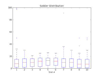
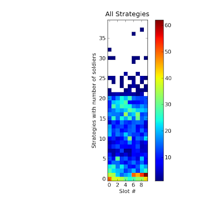
Next, lets try and take a look at all the strategies at once. Lets start with the soldier distributions among the different slots. I will remind you that the rules of the game are slot independent, i.e. if machines were trying to play this game against one another you would expect the soldier distribution to be more or less uniform between slots, any deviation from uniformity probably says something deep and profound about how humans think.

image

Above is a box and whiskers plot of all strategies, looking at the number of soldiers in each slot.

image

This plot is fun. It shows the full distribution of all of the strategies. I went through the database, and for every strategy, added one to the box that held true. I.e. for each slot (the slots are along the x axis), the y axis marks how many strategies in the database have that many soldiers in that slot. Should be fun to try and think about what the non-uniformities mean. Colorbar is on the side to make the colors quantitative.

Point Distribution

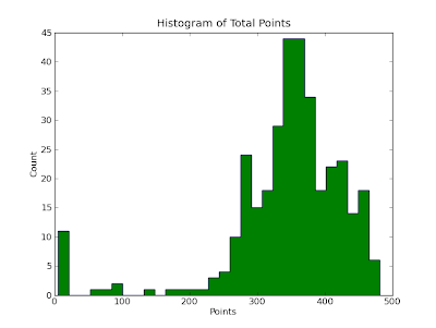
So, how well do all of the strategies do... lets take a look.

image

Above is a histogram of all the scores for all the strategies in the database. It has some interesting features. Definitely not singly peaked. What do you think is going on on the far left?

image

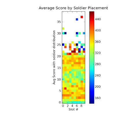
In this plot, I again went through all of the strategies in the database, and this time, every square reflects the average score for all strategies that have that many soldiers (y axis) in that slot (x axis).

Strategies Layout

Lets drill down a bit and look at how each strategy performs.

image

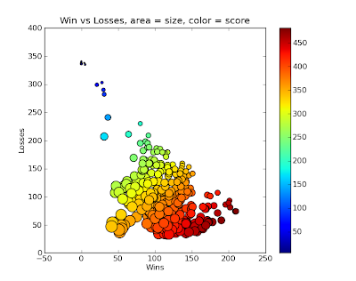
This scatter plot has a point for each strategy in the database, the x coordinate giving its number of wins, the y coordinate its number of losses. The area of the circle is scaled to its number of ties, and the color is scaled to its total score. Is there a clear trend? Why does it fan out?

image

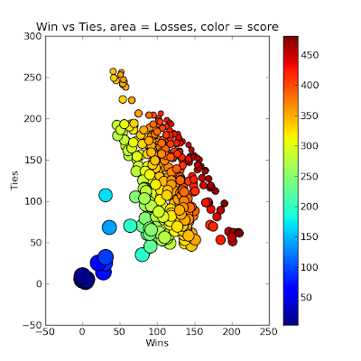
Similar plot as above but this time, x coordinate is Wins, Y is ties, size is losses and color score.

image

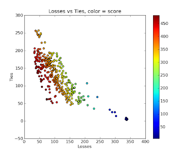
One more, this time x coordinate is losses, y is ties, color is score.

Fitness Landscapes

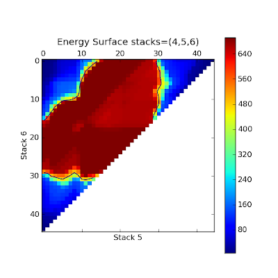
So, what should you do if you wanted to design a winning strategy? Lets first take a look at the fitness landscape. Now, this is difficult to do for the whole game, with 10 slots and something like 40 reasonable choices for each, this is some huge 10 dimensional space, which is difficult to visualize, so instead lets take a look at the fitness landscape for some lower dimensional cuts.

image

So in the above plot, what I've done is constructed a whole bunch of strategies. First I started with 8 soldiers in all slots but the ones listed in the title, namely slots 4,5,6 (starting with 1). So with only 3 slots free, and with the constraint that we have to have 100 soldiers total, I can parametrize a whole bunch of strategies with only two numbers, in this case the number of soldiers in slot 5 (x axis) and slot 6 (y axis). The color represents the score that the resulting strategy has when run against all of the previously existing strategies in the database. This was created without adding all of these strategies to the database itself as that would have changed the results.

image

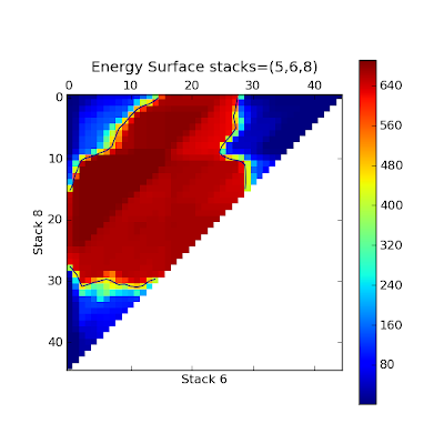
Similar plot, this time changing the soldiers in slots 5,6 and 8 with x axis the number of soldiers in slot 6 and the y axis the number of soldiers in slot 8.

image

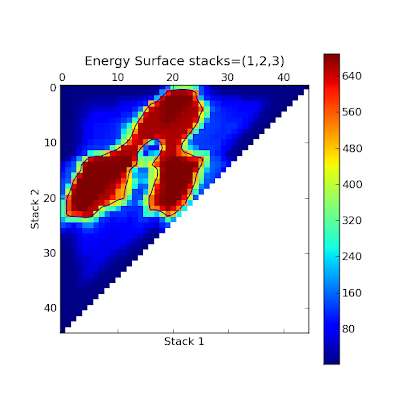
Another one, hopefully my labels make enough sense now that I don't have to spell it out. I think this one has an interesting shape. What's going on?

image

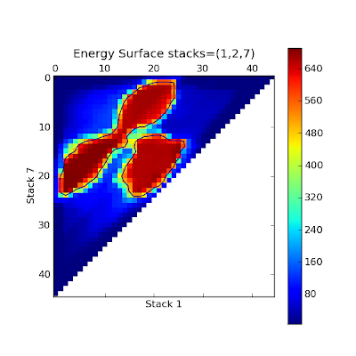
One more.

Random Strategies

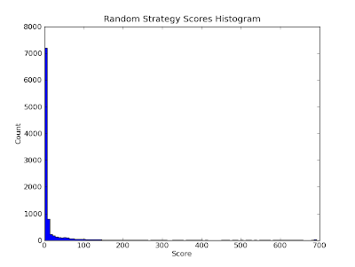
So, lets say you are trying to construct winning strategies. The first thing you might try to do is construct random strategies, by randomly dropping 100 soldiers each into one of the slots at random. Doing so and running these strategies against the database I got an idea of how effective that would be.

image

Above is a histogram of the random strategies' scores. Not so good. Looks like humans playing the game are better than randomly guessing.

Best Strategy?

So lets say you wanted to make the best strategy, what could you look at? Well, for starters you might be interested in a question like the following? 'If I put N soldiers in slot X, what percentage of the existing strategies in the database would I beat in that slot?" The next graph answers this question.

image

Here I have attempted to show for every X,Y coordinate the following. With Y soldiers in slot X, what percentage of the existing strategies do you beat in slot X. I changed the color scaling to make it more refined, so you can better read it quantitatively.

Go Forth

So, there you have it. You are not fueled with what is probably way more information than you were hoping for. Hopefully these graphs are more than just pretty, and get you thinking a bit. That is a lot of what science is about. Make some observations and then attempt to explain the results with your own models. You can then test your models with experiment. I've provided you with a bunch of observations and invited you to construct your own explinations. Now I invite you to perform an experiment. Think you know whats going on in the game? Then try and beat it. The link to play is the same as before.

Steak Dinner

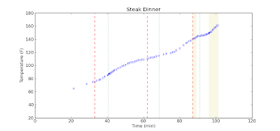
Sorry about the blog hiatus. During the summer, without teaching classes, inspiration is harder to come by. But, tonight I cooked a steak. I recently got a new digital meat thermometer. My plan was to slowly cook the steak until the internal temperature got to be about 140 degrees Fahrenheit with the oven at 200 degrees, take it out, wrap in tin foil, crank the oven to 500 degrees, stick it back in, and give it a nice exterior, reaching an internal temperature of about 150 degrees which would put it at about medium. After I put the steak into the oven though, I started to watch the temperature go up on my digital thermometer and thought, why not take data. And so I did. Here are the results.

image

Above you see the internal temperature of the steak as a function of time. First some comments about the graph.

  • The steak started at 37 degrees, the temperature of my refrigerator.
  • I didn't start taking data until about 20 minutes in.
  • The red dashed lines mark where I turned up the temperature of the oven. It started at 200 degrees, then 250, then 300, and in the final stretch, 500 with the broiler.
  • The green dotted lines mark where I got impatient and opened the door to the over to check on the food.
  • The yellow background denotes where the steak was outside of the oven resting in tinfoil.

Now some comments on the data

  • You can clearly see a change in the data when I changed the oven temperature.
  • Opening the oven door really seems to slow down the cooking process
  • The temperature of the center of the steak continues to rise after you take it out of the oven.
  • In fact, curiously enough, the temperature of the center of the steak seems to have risen the quickest after it was taken out of the oven.

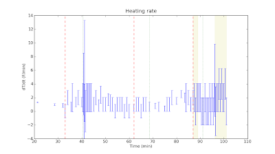
Next I decided to look at the heating rate, computed by taking the finite differences of my data points and propagating the errors.

image

As you'll see, I really didn't have enough data points or a precise enough thermometer to really see the changes in the heating rate. Finally some comments about the food.

  • The steak was good. You'll notice I shot past 150, ended up with a temperature of about 160, and a steak that was nearly medium well.
  • Cooking the steak slowly like this yielded as pretty soft texture, akin to a roast. Heck, I essentially roasted the steak.
  • The steak was served with asparagus and baked potatoes. As an interesting aside, the baked potatoes were in the oven along with the steak the whole time, but did not cook all the way through. I normally bake potatoes at 350 for about an hour, and here they were in a hot oven for over an hour and a half, half an hour of which was above 300, but they didn't cook through.

I clearly have too much time on my hands. I have one more steak, and I think I'll try a different cooking method. Maybe I'll have the patience to take data again, we'll see.