Life in the Infrared


image 
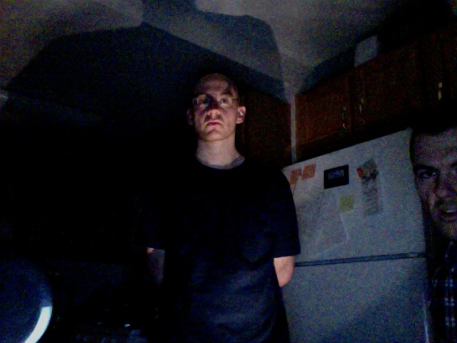
Corky, Matt, and Jared, with the experimental apparatus.


There's a place where TV remotes are flashlights, Wii's are torches, and Snuggies are translucent. It's our kitchen. We modified a 3 dollar webcam to view in the infrared portion of the electromagnetic spectrum. We'll show you how, and what you can do with it. First, a little bit of background. If you read the previous post by Alex, you'd know that visible light waves are the same kind of waves as radio waves, microwaves, and x-rays; they just wave at different frequencies. Light that has a frequency just below what we can see is called "infrared", which apparently derives from the latin infra--below red (thanks wikipedia!). So we know that if we get an object hot enough, it will glow visibly. However, warm objects (say, humans, cars, tanks) while not emitting enough visible light to glow, will emit easily detectable infrared light. This makes infrared imaging a handy technology for finding warm things in the dark. And, since many opaque things in the visible are transparent in the infrared (or vice versa), you can dream up a lot of fun to be had if you could only see in the infrared. Well, it turns out that the CCDs in many common webcams are sensitive to the infrared (IR). However, since an infrared signal would make for a weird looking visible light picture, it is simply filtered out. Well, we (mostly Matt) got our hands on such a webcam, for a whopping 3 dollars, and removed the filter. Then we turned the tables, and inserted a visible light filter. For this we used the darkest part of a developed film roll, and while not getting rid of all the visible, it did a pretty good job with the lights down low. You can get a junk roll from your local Rite Aid photo center for free, just ask for Sue. She is very helpful. So we took some pictures of whatever we could find that was a strong IR source. It turns out that our particular camera wasn't sensitive to detect the signal of a warm human (or a cold one for that matter). We had to get something just a little hotter. So we lit a stick on fire, and then blew it out. Here's what it looks like in the now very pedestrian visible spectrum, with the lights out: image 
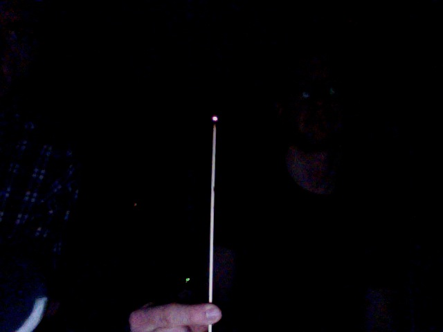
It's just barely glowing. Now, let's look at it in what I'll call "enhanced" visible with the lights on, meaning that it's sensitive to both IR and visible at the same time. image The infared obviously dominates the output. It looks like an IR sparkler. Now, let's shut the lights off, and see only IR: image 
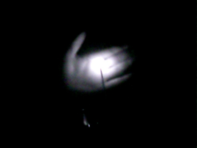
It's bright enough to "light up" my hand, which it certainly couldn't do in the visible. Okay, so we had to light this thing on fire, and it was already glowing. Well, my response to that is...this spoon: image 
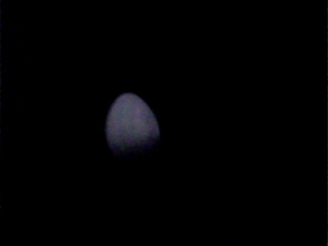
Normal spoon. But actually we heated it up a bit on the stove. Here it is in enhanced visible: image And now, lights off, infrared only: image Apparently we only heated up the tip significantly. 
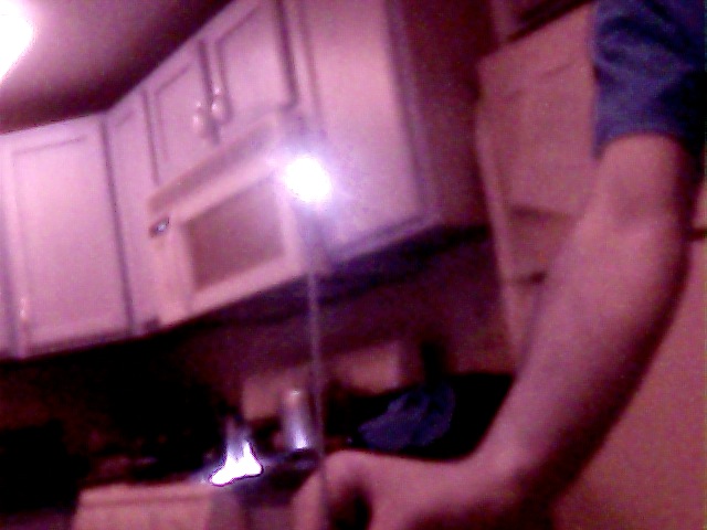
Now, we have a super high tech flashlight that has three modes. It can produce green LED light, white LED light, or incandescent white light. Corky pointed each one at me. White LED light, visible: image Creepy, eh? It's the shaved head. Now, white LED light in the IR: image Nuthin' doin'. Similarly for green LED light. This is included only for its creepiness. First, in the visible: image Corky calls this "the most palatable [pronounced incorrectly] picture of Jared we could find." In the IR, nada: image 
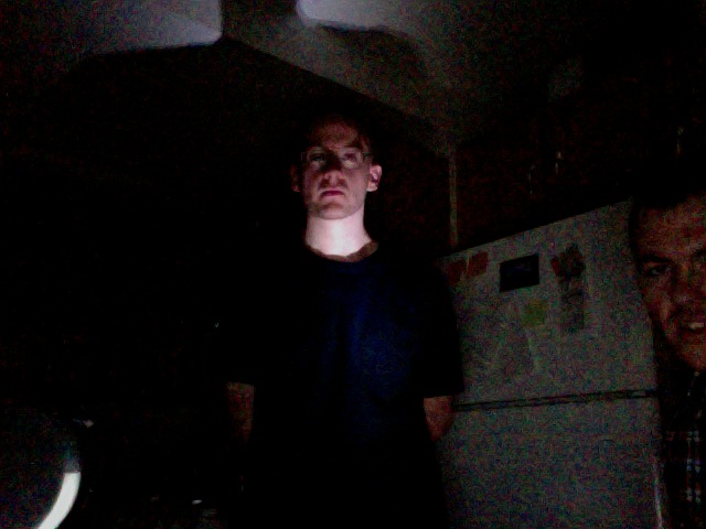
But for incandescent white, in visible:
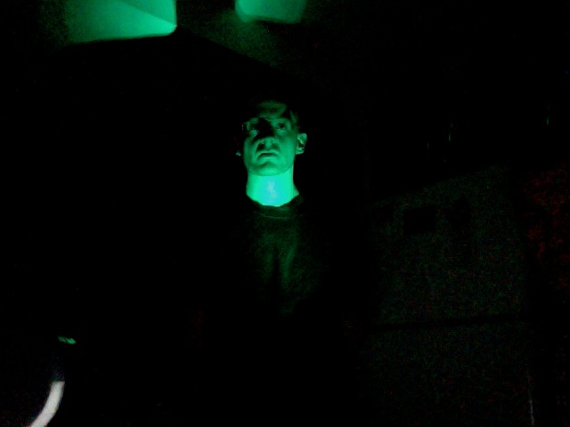
 image And IR: image I am aglow! Matt is clearly shocked. This happens because light generated by LED's occurs because of electrons hopping around semi-definite energy states of a material, making semi-definite frequencies of light. However, incandescent light is due to the filament being glowing hot, emitting radiation over a wide range of frequencies, and we know that it's got a strong contribution in the IR. So much for hot things. You have a bunch of IR dedicated sources around your house that maybe you didn't know about. One such source is many TV remote controls. Here we are, in the visible, with the lights low, pointing remotes at our faces. image This is actually a promo pic for our 80's new wave band. Here's what this looks like, with buttons depressed, in the IR: image 
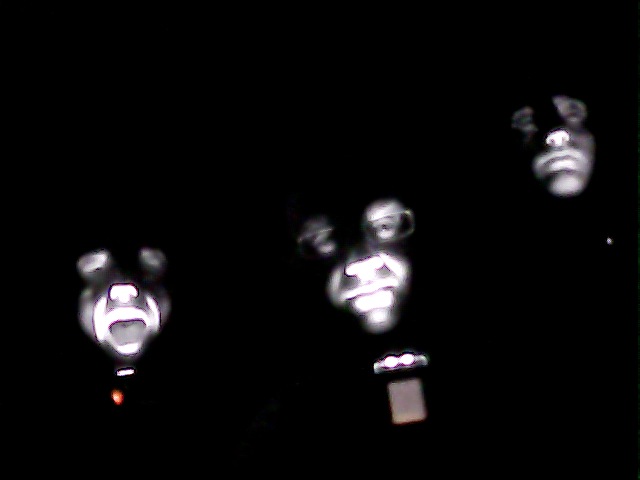
A personal favorite. These remotes weren't the brightest source we could find. It turns out that the Wii sensor bar (which actually transmits, rather than receives data) is a freakin' beacon (say that out loud). Here it is, on top of our TV, which Corky is apparently flying towards. image 
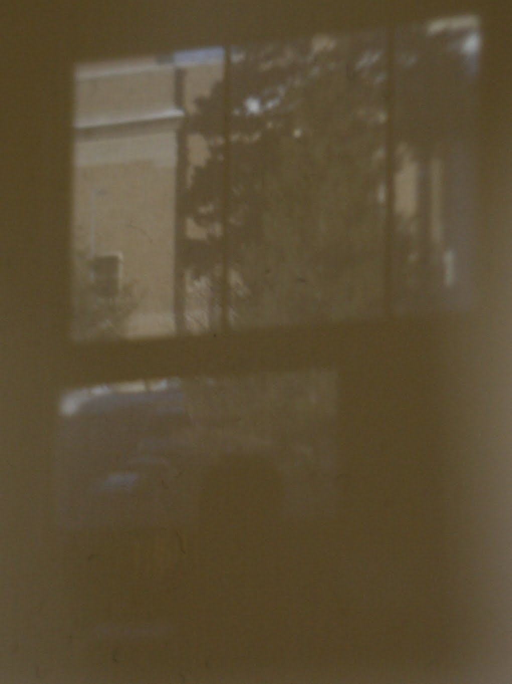
Unassuming little guy in the visible. But with the Wii on and in IR mode: image 
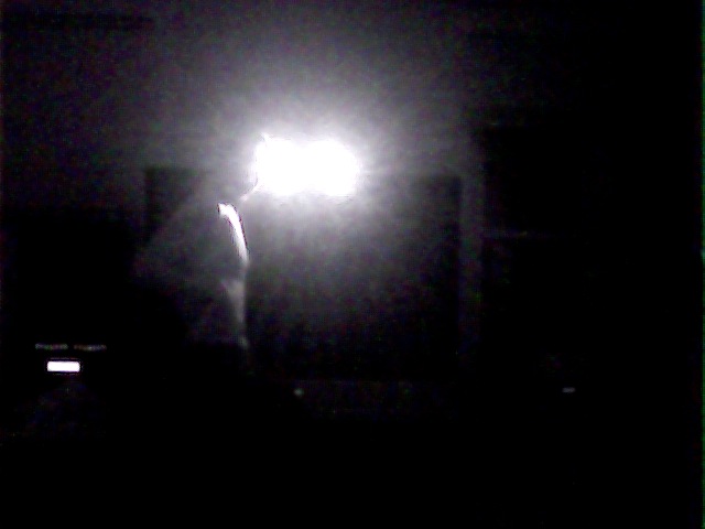
There's a person in there too, IR bathing. But I promised you translucent Snuggies. (Yes, we own a Snuggie, and highly recommend them.) Here's Matt hiding behind one, whilst I angrily supervise: image 
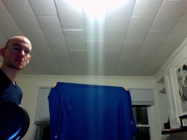
Now, let's look behind the curtain with IR: image 
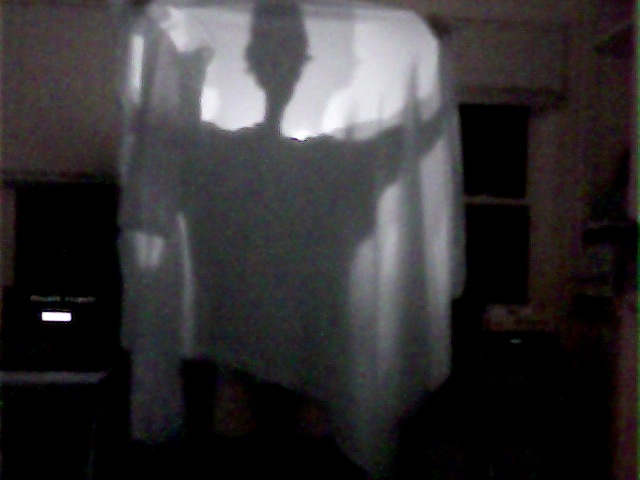
Look, I told you it was a Snuggie, the sleeve is visible! Now, if we had more resolution, we could even pick out a person in a dark room, and look at the temperature variations of objects. However, with approximately an hour of fiddling and 3 dollars, I think we did pretty good. We're not hard to entertain, but this definitely did the trick.

Free data set of the month: Imaging Spectroscopy

There's a lot of free data sets floating around the internet, and while things like funny cat videos and the results of color-naming surveys get a lot of play, many others don't get used for much. Recently I've been playing around with one such data set: images from the Airborne Visible/Infrared Imaging Spectrometer (AVIRIS).

I've always found it interesting that the way we perceive color is very different from how light actually works. Most of us have three different types of cones in our eyes and we perceive different colors as different combinations of stimuli to these three types of cones. In a very rough sense, when we look at a color, our brain gets three different numbers to figure out what it is. Light, on the other hand, is a bunch of photons with some distribution of wavelengths. To fully describe the light coming from an object you need a function that shows how many photons are at any given wavelength, which is way more complicated than just the three numbers we get.

So what about all that information that gets thrown away on the way to our brain? Are we missing out on a magical world of super-duper colors and wonder? Not really, but skip past the break anyways to find out more.

There are a few things our eyes have a hard time distinguishing. For example, take a look at this picture of a low-pressure sodium lamp:

image

If you've ever been in a sketchy parking lot at night or an intro physics class you've probably seen one of these in real life. It looks just like the picture right? It does to us, but the light coming from the picture and the light from the real lamp are totally different. All the photons from the real lamp have wavelengths very close to 589 nanometers, while the ones coming from the picture on your screen have a bunch of different wavelengths ranging from 500 to 700 nanometers, depending on what type of monitor you have. (It's easy to build your own spectrometer and see this for yourself.)

imageThis is an extreme example since there are few objects that emit purely monochromatic light. What do normal objects look like spectroscopically? I wanted to find out, but unfortunately there's not too many freely-available spectroscopic images of everyday objects floating around the internet, and my attempts to make my own were stymied by the fact that no one wanted to let me borrow $20,000 worth of optical bandpass filters. However, there are a several orbital satellites and planes which take spectroscopic images of the earth, and one of them, AVIRIS, has a few sample data sets for people to play around with. I recently wrote some code to help me look at one data set in particular – a spectroscopic image of Moffett Federal Airfield in California, shown here in a normal picture from Google Earth.

AVIRIS acts much like a normal camera, but instead of three wide-band filters for distinguishing color it uses 225 narrow bands ranging from 366 nanometers (near UV) to 2500 nanometers (near IR). Any of these bands can be thought of as a single monochromatic image. Here I have plotted two bands side by side for comparison. The right image is at 463 nanometers (a nice blue color) and the other is at 2268 nanometers, well into the infrared. (Both images are false-colored to enhance the contrast).

image

The scene looks a lot different at the two different wavelengths. In the first image there's one area that's particularly bright – it is one of several settling ponds belonging to a Morton Salt factory, although I have no idea what is special about this one that makes it reflect blue light so strongly. The second image highlights different features and clearly shows the difference between the moving water in the creeks and the standing water in the bay.

These are just two of the bands, but you can see all of them fly by in the movie below. (Note that the color scale is set for each band individually, which is why there sometimes seems to be a large change between adjacent bands).

If you agree with me that the embedded video looks super-crappy you can download the original here (6.4 MB).

One of the things that struck me about this video is that it seems like much of the image doesn't change too much through the whole visual range. Not surprisingly, it's a lot easier for us to distinguish between the slight differences in color in a normal image than it is for us to distinguish between the slight changes of intensity here.

So what do the spectra of individual points in the image look like? Let's focus on a few easily-identifiable objects. (I'll talk about how I made the roughly-true color image below in a later post).

image

The first thing that stands out is that there's a lot of features that are common to all of the locations, such as the big gap near 1750 nanometers. While the sun sends photons with a distribution of wavelengths roughly described by Planck's Law, certain wavelengths are strongly absorbed by gasses in the atmosphere as shown below:

image

Looking at the different spectra we can see that liquid water absorbs strongly in the infrared, and the green grass on the golf course reflects strongly in the near-infrared (no clue why). There is also a clear difference in intensities for each of the locations in the visual range, but the five locations otherwise look quite similar, even though they are very different colors in real life.

I'll look at a few more interesting things in this data set and talk a bit about about how our eyes and brains process color in a later post.

Exploration of Cameras I

In the next posts, I'd like to attempt to make a camera from 'scratch.' And by that, I mean explore the creation of cameras from their components and then create a very primitive one from readily available materials.

In terms of history and simplicity, we should start with the pinhole camera. I've heard stories that Newton used a pinhole camera to look at the sun though I don't know if this was before or after he stared directly at it for 8 minutes. The pinhole is neat because it is so simple. With a pinhole, light is focused simply by restricting the paths which an incident ray may take to hit our film. Typically, diffuse and specular scattering sends light bouncing every which way off an object. The pinhole just restricts which directions hit the film. I think a picture is a better guide to this concept.

image

For a small hole (aperture) there is approximately one area of the object that will send rays to a particular part of the image. Of course there is a very small angle of error for pinhole cameras made with millimeter sized pins. As the hole increases in size, more rays are incident to the same section of film. And finally, when the hole is big enough for the whole object to be seen through it (think window), no cohesive image is formed.

So if we make the hole small enough, then we can have all the clarity we want, right? Well, I guess so. It would have to be a very circular hole and it would only let in a very tiny amount of light making exposure times long. How to fix this?

Yea, you guessed it. A lens is the answer. It is able to focus light on its own. Now we can collect more light and still make clear images. But the catch is that it only works for a range of distances. So again, lets consider a lens and the images of two objects at different distances.

image

Ray drawing can be done with 3 simple rules (though two are needed in practice).

  • rays that go in parallel to the axis go out through the focal point
  • rays that go in through the focal point go out parallel (time reversal symmetry)
  • rays that go through the center are not altered

Using these rules, the first object which is at the proper distance for the film position and focal length of the lens is in focus. However, the rays from the object further away do not converge at the film and so are out of focus.

Here its time for two experiments.

\1) The Window Camera Go to a room with a single window and cover it with thick paper that has a single hole in it. Given enough light, you should see an image on the far wall. If not, hold a piece of white paper up close to the hole. [Edit: I just learned this has a name: camera obscura]

\2) The Doorway Camera Now, find a lens and a doorway. In one room, leave the light on and go to the far wall in the dark room. Bring the lens to the wall until you can see an image. The doorway is the aperature, lens the lens, and wall the film. This demonstration is very simple and not too surprising. BUT SO COOL. I encourage it vigorously. The following pictures were taken of my images in case you can't find a lens. [Edit: I guess this falls under camera obscura too]

image

Bailey Hall through a window in the physics building.

image

Same scene as imaged with a lens using the window as an aperture.

image

Image of a ceiling light with a smaller lens

imagePhysical Sciences Building imaged on wood.

imageAn extra small image (\~1cm on a side) from the lens that will be in next post's camera.

Together, these two elements – aperture and lens – make a very good camera. The lens is able to collect a lot of light and focus it on the film. The aperture can enhance clarity by reducing the number of paths that light rays can take to your lens. It also provides higher order corrections that come from the fact that the lens is probably not perfect. That is, lenses are notorious for misbehaving around the edges and introduce displacements in the whole image as well as between the colors. The aperture helps keep light from traveling through these edges.

Next time, a very simple camera.

The Magnetar Credit Card Swipe


image Ned Flanders' credit card doesn't satisfy the Luhn checksum, but could probably still be erased by a magnetar.


Hello, Internet! Today I'd like to talk about the Magnetar Credit Card Swipe. Sounds like some sinister short on a derivatives deal, doesn't it? Well, no need to worry, we don't deal with scary things like that here. Instead, we are going to talk about a super-magnetized neutron star speeding past Earth. A while ago I heard that a magnetar can erase all the world's credit cards from half the distance to the moon. I did a little research and it seems like this is the go-to "fun fact" about magnetars. Almost every time they are brought up in a popular science article, their credit card-erasing prowess is sure to get a mention. So let's check it out! First things first, though. What the heck is a magnetar [1]? Well, "magnetar" is just a spiffy name for a particular flavor of neutron star. Now, neutron stars are already pretty extreme objects. They've got a little more than the mass of the sun squished down to the size of a big city with a central density over 10 trillion times greater than lead.


image Dipolar magnetic field


What makes magnetars truly name-worthy (and more extreme than Doritos and Mountain Dew at the X-Games) is the fact that they have strong magnetic fields. And when I say strong, I mean really strong. Taking the magnetic field to be dipolar (like the Earth's, see figure), the field at the poles of a magnetar can be as high as 10^15 gauss [2]. For comparison, the magnetic field of the Earth is about half a gauss and the big magnets used in MRIs are about 10^4 gauss. So we're talking about some big fields! Looking up the specs for a typical credit card, it looks like most take about 1000 gauss to erase. And now we can get started. I always forget the exact form of the magnetic field of a dipole, but Jackson doesn't. He tells me that it is $$ \vec{B}\left(\vec{r}\right) = \frac{3\vec{n}\left(\vec{n}\cdot\vec{m}\right) - \vec{m}}{|\vec{r} |^3}$$ where m is the magnetic dipole moment, r is the displacement vector to where we are measuring the field, and n is a unit vector that points to where we are measuring. To find the magnitude (which is what we really care about), we just take the dot product of the vector with itself and take the square root. Working this out we get $$ B\left(\vec{r}\right) = \frac{|\vec{m}|}{r^3}{\left[ 3\cos^2{\theta}+1\right]}^{1/2} $$ where theta is the angle between the magnetic moment vector and the direction vector n. But we are just looking for a rough estimate here so let's just set the cosine term to one. Now we have $$ B\left(r\right) = \frac{2|\vec{m}|}{r^3}$$ We can now use the above to our advantage. Since we are assuming we know the polar magnetic field strength, we can rearrange and solve for the magnetic moment. At the pole of a star the distance is just going to be the radius, so for radius R and field strength Bp, we get $$ |\vec{m}|} = \frac{1}{2}B_{p}R^3 $$ Plugging this back in, we get a nice little formula for the strength of the magnetic field in terms of the stellar radius and the polar field strength $$B(r) = B_{p}{\left(\frac{R}{r}\right)}^3 $$ And we are almost there! Rearranging now for r, we get $$r = R{\left[\frac{B_p}{B(r)}\right]}^{1/3} $$ Huzzah! Now we just need to plug in some values. Well, we'll use Bp = 10^15 gauss, B(r) = 1000 gauss (strong enough field to erase credit cards) and R = 10 km, which gives... $$ r \approx 10km \times {\left(\frac{10^{15}gauss}{10^{3}gauss}\right)}^{1/3} $$ so $$ r \approx \mbox{100,000 km} $$ The moon is about 380,000 km away. So we find that the magnetar will erase all credit cards up to a little over a quarter the distance to the moon. Not bad! However, all this talk of "half" and "quarter" is a bit misleading given that our best guesses here will be order of magnitude. But, overall, we see that a magnetar at roughly the Earth-Moon distance would have a good shot at erasing your credit cards. Fun fact confirmed! [1] For a really nice Scientific American article about magnetars, see here. For more information than you could probably ever want, see here. [2] For those of you who prefer your magnetic field strengths given in units named after someone played by David Bowie in a movie, you may note the conversion: 1 gauss = 10^-4 tesla.

Falling Ice

image It's been a while since I posted anything, much to my shame. Hopefully this post marks a change in that streak. Today I'm going to consider a very practical application of all this physics stuff. One of my housemates parks his car on the side of the house, with the front of the car facing the house. Living in Ithaca, NY, the weather has been the usual cold and snowy, like the rest of the northeast USA this winter. Yet, early last week, we had some unusually warm weather, in the 30s (fahrenheit). A few days later, my housemate went out to his car, and discovered that falling chunks of ice had broken his windshield! Now, to be clear here, I'm not talking about icicles, I'm talking about large, block-like, chunks. My best guess is that during the warm days, snow on the roof turned into chunks of ice, and slid off the roof. The question I'm going to try to answer today is: How far from the house could these chunks possibly land? Put another way, what I want to know is, how far from the house would we have to park our cars to not risk broken windshields from falling ice? The First Attempt We'll start with the simplest assumptions we can think of. First, we'll assume that there is no friction on the ice block as it slides down the roof. We'll also assume there's no air resistance slowing down the ice in the air. The maximum range will be given by a block of ice sliding from the top of the roof. Taking the height of the peak of the roof as h, relative to the edge of the roof, we can write down the magnitude of the velocity of the ice chunk when it reaches the edge of the roof. We start by setting the change in gravitational potential energy equal to the change in kinetic energy. Recalling the form for both of these, $$PE=mgh$$ $$KE=\tfrac{1}{2}mv^2$$ we can set these equal and solve for v, $$mgh = \tfrac{1}{2}mv^2$$ so $$|v|=\sqrt{2gh}$$ This should be a familiar expression to anyone who went through introductory mechanics. Now, given that the roof is at an angle theta, we can write down the x (horizontal) and y (vertical) components of velocity, $$v_x=|v|\cos\theta$$ $$v_y=-|v|\sin \theta$$ where I've introduced a minus sign in the y component of velocity to indicate that the ice chunk is falling. Now that we have the velocity, we have to call upon some more kinematics. To figure out how far the ice flies, we have to know how long it is in the air. So we start by considering the vertical motion. The distance traveled by an object with an initial velocity, v_0, and a constant acceleration, a, is given by $$\Delta y=\tfrac{1}{2}at^2+v_0t$$ In our case, the distance traveled is the height of the first two floors of my house. The acceleration is that of gravity, g, and the initial velocity is the y component of velocity we found above. We'd like to find the time it takes to travel this distance. We have to be a little careful with our minus signs, by our convention the acceleration is in the negative direction, and the change in position is negative. Working all of that out, and plugging in our known values, we get $$\tfrac{1}{2}gt^2+|v|\sin \theta t - l =0$$ where l is the height of the house. We can solve this for t, finding $$t=\frac{-|v|\sin \theta + \sqrt{(|v|\sin \theta)^2+2gl}}{g}$$ The horizontal distance traveled is simply the horizontal velocity times the time, $$x=\frac{|v|\cos\theta}{g}(-|v|\sin \theta + \sqrt{(|v|\sin \theta)^2+2gl})$$ a result that you may recognize as the 'projectile range formula' (particularly if I brought the minus on the v sine theta term into the sine, indicating that I'm firing at a negative angle, that is, downwards). Having found that result, lets plug in our velocity, and then some numbers. First, $$x=\frac{\sqrt{2gh}\cos\theta}{g}(\sqrt{2gh}\sin \theta + \sqrt{(2gh\sin^2 \theta+2gl})$$ Now, for some estimation. I'd say that the height of the roof peak is 10 ft, the height of the first two floors of the house is 20 ft, and the angle of the roof is 30 degrees. Having made those estimates, now I just have to plug in all the numbers, yielding $$x=5.2 m=17 ft$$ That's a very long range! Now, I didn't see any chunks of ice that were more than about 7 ft from the house. So we have to question what went wrong with the above derivation. Well, maybe nothing went wrong. I did calculate the maximum range. It's quite possible none of these ice chunks were from the very top of the roof. Still, I'm inclined to think we may have overestimated. I'd say that our initial velocity was too high. The ice, as it comes down the roof, will have to push a bunch of snow out of the way. Even though it may not have much friction with the roof, all that snow will slow it down, and reduce the velocity with which it comes off. I'm just going to guess that about half of the potential energy it had is lost to the snow and roof, as a rough estimation. That would give a velocity $$|v| = \sqrt{gh}$$ and a maximum distance of $$x= 4m = 13ft$$ which is closer to what I observed. The Second Attempt I'm still not completely satisfied with the previous work, the answer doesn't match my observation. As a wise man (Einstein) once said, "make things as simple as possible, but no simpler." I may be guilty of making the problem too simple here. So I'm going to add back in air resistance. In general, we physicists like to avoid this because it usually means we can't get nice, analytic expressions as answers (like the one I have above). Instead, we usually just have to calculate the result numerically. This isn't the end of the world, and often times it is actually a bit easier, but it's not as pretty looking. Still, to satisfy myself, and you, gentle reader, I will step into that realm. We start by writing down the force on our block of ice once it is falling. We've got gravity, and air resistance. Thus $$\vec{F}=-mg\hat{y}-bv^2\hat{v}$$ I've input a drag force that goes as v^2, and is in the opposite direction of v. The 'v direction' is a cop out, because I didn't want to do the explicit direction, so lets fix that. We'll have x and y components, and we note that the magnitude of v times the direction of v is the velocity vector. So, $$\vec{F}=-mg\hat{y}-bv\hat{v}_x-bv\hat{v}_y$$ Breaking this up into components we get $$a_x=-\frac{bv}{m}v_x$$ $$a_y=-g-\frac{bv}{m}v_y$$ This is as far as we can take this work analytically. I'll say a little more about the coefficient b. This depends on the exact size and shape of the object, as well as the medium it is moving through. I'm going to use $$b=.4\rho A$$ because that's what we used for hay bales in my classical mechanics class years ago. Here, rho is the density of air, and A is the surface area of the object. I would estimate that the large face of the ice chunk is roughly one square foot, or .1 m^2. I'd estimate the mass of the ice was around 2 kg. Now, for some magic. I've put all of this into mathematica, and asked it to solve this numerically. First we have the plot for the full initial velocity, $$v=\sqrt{2gh}$$


image The solid line is with air resistance, the dashed line without air resistance. The plot shows vertical vs. horizontal distance, and the units are meters. (click to enlarge)


Next we have the plot for the half initial velocity, $$v=\sqrt{gh}$$


image The solid line is with air resistance, the dashed line without air resistance. The plot shows vertical vs. horizontal distance, and the units are meters. (click to enlarge)


As you can see from the plots, in neither case does it make a large difference, about .2 m. The Third Round The final thought that occurs to me is that perhaps I got the angle of the roof wrong. That would be quite easy. Humans are notoriously bad at estimating angles. I'll plot the results (with air resistance) for 15, 30, and 45 degree angles and the lower velocity.


image The plot shows vertical vs. horizontal distance, and the units are meters. The red line is 15 degrees, the blue line is 30 degrees, and the black line is 45 degrees. (click to enlarge)


In summary, the answer is unclear. What I really need to do is measure the angle of my roof better, because there's a significant angle dependence. It's also quite possible that we didn't see a maximum distance hit (thankfully!). In addition, air resistance doesn't seem to matter much in this particular problem, probably because the distance the thing falls is short enough that terminal velocity is not reached. Hopefully this gave you a bit of a taste of a more practical physics problem, and how to approach air resistance (if you want to see the mathematica code, let me know). The lesson here seems to be either don't park too close to roofs, or have insurance for your windshield!

Darts

image

Over break I went out with a buddy of mine and played some darts. This got me to thinking, where exactly should someone aim in order to get the largest expected number of points? Now, obviously when you are playing a game like Cricket, where you should aim is fairly obvious, you are trying to hit particular numbers on the board, but in the most popular darts game -501, for most of the game you are just trying to accumulate points. So, where should you shoot on the board to get the most points? Well, something that I didn't quite realize before I started this adventure is that while the double bullseye in the center is worth 50 points, the triple 20 is worth more: 60 points. For the uninitiated, in games like 501 you score points based on where the dart falls. The center is the bullseye, where the inner most circle is worth 50 and the ring around it is worth 25, after that you score depending on which of the pie slice things you fall in, the points being the number on the slice. The little ring around the outside is worth double points, and the little ring at about half the board radius is worth triple points. So perhaps the triple 20 is where you should be aiming all the time. But you'll notice that to the left and right of the 20 section are low numbers 1 and 5. So you might suspect that if you can't throw all that accurately, you'll be paying a price for shooting at the triple 20.

The Model

image

In order to answer a question like that, we need to develop a model for dart throwing. In this case, I thought it was safe to assume that dart throws are normally distributed about the place you aim, with some sigma determined by your skill level. To the left is an example of what normally-distributed dart throws look like when the aim is at the center, and with a 1 inch standard deviation in the throws. The dashed line marks a one inch ring to give a sense of how scattered darts can be from 1 standard deviation.

Results

So, off I went, having drawn a dart board (to regulation) in Gimp, and coloring each section in gray scale according to its point values, I used python to perform all of the necessary computations (using primarily the ndimage package in scipy). The result can be seen below.

image

This image shows the optimal position on the board to aim for as a function of how good of a player you are. The rings denote the sigmas, and the dots the center point to aim for. The colorscale gives a quantitative measure of the sigma, in inches. As you can see, the best players should (and do according to youtube) aim for the triple 20, since they are good enough to hit it most of the time, but once you're throw is at about a 1 inch sigma, you should be aiming for the triple 19 in the bottom left. As you can see on the numbered board at the top, the triple 19 is buffered on either side by the 3 and the 7, which are both 2 points above the 20 section's neighbors (1 and 5). So as you might expect if you have a reasonable chance of hitting the sections to either side, the triple 19 offers a higher expected score in the long run. The other limit we can understand is the limit of really bad throws. If you have a nontrivial chance of missing the board altogether, then obviously you should just aim for the center of the board, in the hopes that you at least hit the thing. But interestingly, in between the track that the optimal aiming point takes is a little interesting. It tends to the center (as we should expect), but it takes a curvy sort of root along the bottom left quadrant of the board. Neat.

Heat Maps

In order to get a little better of a feel for why the track takes the path it does, I decided to look at the heat maps for the expected score at every location on the board for a set of given sigmas. So, in the images below, the colors above the board indicate the relative score expected if you aimed at that point.

image

Above is for a quarter inch sigma throw [Click to zoom]. Notice that the triple 20 is the place to hit, as expected.

image

Above is a half inch sigma throw. The triple 20 is still in the lead, but not by a whole lot. You can really see how if your aim is as good as a half inch sigma, you can really still see the triple spots as true features.

image

Above is a 1 inch sigma throw. Now the lower left hand quadrant has taken over as the optimal place to throw. Notice that both the triple 16 and triple 19 make decent targets. The triple 14 also makes a showing, due probably to its large neighbors.

image

Above is a 1.5" sigma. The triple 20 is nearly gone as a place of interest on the board, since we are no longer good enough to really capitalize on it. The lower left hand portion of the board is the place to be. We've really sort of lost any distinct features of the triple spots, and now are just looking at quadrants of the board as a whole. Our aim seems to tend to center a bit, as we are now in a little danger of falling off the board.

image

At 2" sigma, we can really only hope to aim left-of-center.

image

At 2.5" sigma, we really just want to hit the board.

Lesson

So, now I know, personally, I really just ought to aim just left of center.

Holiday Hidden Message Revealed

image Here we present the solution to the Holiday Code (original post here). The content of the message is from the creepy looking gentleman to the left, Henry Wadsworth Longfellow. He is perhaps most famous for writing the poem, "Paul Revere's Ride." I have taken another one of his popular poems, "Christmas Bells," and hidden its first verse in a huge mess of random letters. The message: "I heard the bells on Christmas Day Their old, familiar carols play, And wild and sweet The words repeat Of peace on earth, good-will to men!" Sounds pretty pleasant at the start. But it was written at the height of the Civil War and it gets pretty heavy towards the end. Longfellow was an ardent abolitionist and most of his poems contain allusions to the plight of slaves. He was also close friends with Senator Charles Sumner, whose own fiery oratory and opposition to slavery famously put him on the wrong side of a Southern cane. So how do we go about divining the message above from the mess of the original code? Well, the message is explicitly in there, it's just hidden by a bunch of randomly generated letters. To get the message out, one needs to know how the junk is distributed. To do that we use the first hint. The first hint was a list of pie fillings. So we will need to use pi to find out how the junk is filling the message: ybeinhhhzcezavdqfnrkutxyvqlzdwctagqdzbhderikeazrbcgjhwentgyqjnylvonrzobvclzeskypvscejbpftuzoladngzckwuhwcvdreyxrsmlwivrauuxssotmhakglmtawuahzdslwudvouxcasjaqzeynatsvzizxlhlxzbcrsziersohkirguobghmobedlwjwunozwdgptofdatcmgspjmrmprxepckiulxwiewniqgegzlzbpauntrzqvcsuscacpndngxjxyanvrrfqthhisomgnqxlsspnrufgljlhcwcywavxyaibvndjyonnfuxstkydsqpawrhpbjbwpeixkgblwcvddcrcofaipfdkkkgdnjkdrbaswfhqdypoevwrbezwtegtwnobuhtqnsyhethvoxhwcookyhahvaqrzquyoiduusrupmeqdefeypsyneoecpvvlatexnweorsufzhsaphcenptwpoywhuxqlrfprnaeusrqaqxdqrlqzcsnejaozjohxpnfccsemuavrltvafxoujhgjebvyyofehogomooljtoshbrdpeknoxdwwvrislevhplxyrzcfiotokrvjqlvwmvkgfdfedhqdin There are 3 junk letters before the first message letter, 1 before the next, then 4, 1, 5, ... So the number of junk letters before a message letter is given to you by pi. This site may prove useful....

Benford's Law

Given a large set of data (bank accounts, river lengths, populations, etc) what is the probability that the first non-zero digit is a one? My first thought was that it would be 1/9. There are nine non-zero numbers to choose from and they should be uniformly distributed, right? Turns out that for almost all data sets naturally collected, this is not the case. In most cases, one occurs as the first digit most frequently, then two, then three, etc. That this seemingly paradoxical result should be the case is the essence of Benford's Law. Benford's Law [1] states that for most real-life lists of data, the first significant digit in the data is distributed in a specific way, namely: $$ P(d) = \mbox{log}{10}\left(1 + \frac{1}{d}\right) $$ The probabilities for leading digits are roughly P(1) = 0.30, P(2) = 0.18, P(3) = 0.12, P(4) = 0.10, P(5) = 0.08, P(6) = 0.07, P(7) = 0.06, P(8) = 0.05, P(9) = 0.04. So we would expect the first significant digit to be a one almost 30% of the time! But where would such a distribution come from? Well, it turns out that it comes from a distribution that is logarithmically uniform. We can map the interval [1,10) to the interval [0,1) by just taking a logarithm (base ten). These logarithms are then distributed uniformly on the interval [0,1). We can now get some grasp for why one should occur as the first digit more often in a uniform log distribution. In the figure below, I have plotted 1-10 on a logarithm scale. In a uniform log distribution, a given point is equally likely to be found anywhere on the line. So the probability of getting any particular first digit is just its length along that line. Clearly, the intervals get smaller as the numbers get bigger. image But we can quantify this, too. For a first digit on the interval [1,10), the probability that the first digit is d is given by: $$ P(d) = \frac{\mbox{log}(d+1) -\mbox{log}{10}(d)}{\mbox{log}(10) -\mbox{log}{10}(1)} $$ which is just $$ P(d) =\mbox{log}(d+1) -\mbox{log}{10}(d) $$ or $$ P(d) = \mbox{log}\left( 1 + \frac{1}{d} \right) $$ which is the distribution of Benford's Law. So how well do different data sets follow Benford's Law? I decided to test it out on a couple easily available data sets: pulsar periods, U.S. city populations, U.S. county sizes and masses of plant genomes. Let's start first with pulsar periods. I took 1875 pulsar periods from the ATNF Pulsar Database (found here). The results are plotted below. The bars represent the fraction of numbers that start with a given digit and the red dots are the fractions predicted by Benford's Law. image From this plot, we see that the pulsar period data shows the general trend of Benford's Law, but not exactly. Now let's try U.S. city populations. This data was taken from the U.S. census bureau from the 2009 census and contains population data for over 81,000 U.S. cities. We see from the chart below that there is a near exact correspondence between the observed first-digit distribution and Benford's Law. image Also from the U.S. census bureau, I got the data for the land area of over 3000 U.S. counties. These data also conform fairly well to Benford's Law. image Finally, I found this neat website that catalogs the genome masses of over 2000 different species of plants. I'm not totally sure why they do this, but it provided a ton of easy-to-access data, so why not? image Neat, so we see that wide variety of natural data follow Benford's Law (some more examples here). But why should they? Well, as far as I have gathered, there are a few reasons for this. The first two come from a paper published by Jeff Boyle [2]. Boyle makes (and proves) two claims about this distribution. First, he claims that "the log distribution [Benford's Law] is the limiting distribution when random variables are repeatedly multiplied, divided, or raised to integer powers." Second, he claims that once such a distribution is achieved, it "persists under all further multiplications, divisions and raising to integer powers." Since most data we accumulate (scientific, financial, gambling,...) is the result of many mathematical operations, we would expect that they would tend towards the logarithmic distribution as described by Boyle. Another reason for why natural data should fit Benford's Law is given by Roger Pinkham (in this paper). Pinkham proves that"the only distribution for the first significant digits which is invariant under scale change of the underlying distribution" is Benford's Law. This means that if we have some data, say the lengths of rivers in feet, it will have some distribution in the first digit. If we require that this distribution remain the same under unit conversion (to meters, yards, cubits, ... ), the only distribution that satisfies this distribution would be the uniform logarithmic distribution of Benford's Law. This "scale-invariant" rationale for this first digit law is probably the most important when it comes to data that we actually measure. If we find some distribution for the first digit, we would like it to be the same no matter what units we have used. But this should also be really easy to test. The county size data used above was given in square miles, so let's try some new units. First, we can try square kilometers. image Slightly different than square miles, but still a very good fit. Now how about square furlongs? image Neat! Seems like the distribution holds true regardless of the units we have used. So it seems like a wide range of data satisfy Benford's Law. But is this useful in any way or is it just a statistical curiosity? Well, it's mainly just a curiosity. But people have found some pretty neat applications. One field in which it has found use is Forensic Accounting, which I can only assume is a totally rad bunch of accountants that dramatically remove sunglasses as they go over tax returns. Since certain types of financial data (for example, see here) should follow Benford's Law, inconsistencies in financial returns can be found if the data is faked or manipulated in any way. Moral of the story: If you're going to cook the books, remember Benford! [1] Benford's Law, in the great tradition of Stigler's Law, was discovered by Simon Newcomb. [2] Paper can be found here. Unfortunately, this is only a preview as the full version isn't publicly available without a library license. The two points that I use from this paper are at least stated in this preview.

Holiday Hidden Message


image Evil gun-wielding code-breaking robo-santa from Futurama


Greetings and happy holidays! Everyone has gone home for the break, so we will be taking a break from the grossly misnamed "Problem of the Week" for a while. Instead, here's a "Christmas Code" I made up for a friend. Figure it out and win the respect of strangers on the Internet! Largely unhelpful hints after the break. ybeinhhhzcezavdqfnrkutxyvqlzdwctagqdzbhderikeazrbcgjhwentgyqjnylvonrzobvclzeskypvscejbpftuzoladngzckwuhwcvdreyxrsmlwivrauuxssotmhakglmtawuahzdslwudvouxcasjaqzeynatsvzizxlhlxzbcrsziersohkirguobghmobedlwjwunozwdgptofdatcmgspjmrmprxepckiulxwiewniqgegzlzbpauntrzqvcsuscacpndngxjxyanvrrfqthhisomgnqxlsspnrufgljlhcwcywavxyaibvndjyonnfuxstkydsqpawrhpbjbwpeixkgblwcvddcrcofaipfdkkkgdnjkdrbaswfhqdypoevwrbezwtegtwnobuhtqnsyhethvoxhwcookyhahvaqrzquyoiduusrupmeqdefeypsyneoecpvvlatexnweorsufzhsaphcenptwpoywhuxqlrfprnaeusrqaqxdqrlqzcsnejaozjohxpnfccsemuavrltvafxoujhgjebvyyofehogomooljtoshbrdpeknoxdwwvrislevhplxyrzcfiotokrvjqlvwmvkgfdfedhqdin Hint 1: Apple, pumpkin, pecan, ... Hint 2: Paul Revere

A Buffoon's Toothpicks


image Figure 1: Two of the thousands of toothpicks on my floor


You're sitting at a bar, bored out of your mind. You've got an unlimited supply of pretzel rods and a lot of time to kill. The floor is made of thin wooden planks. How can you calculate pi? This is how the problem of Buffon's needle was first presented to me. Stated more formally the problem is this: given a needle of length l and a floor of parallel lines separated by a distance d, what is the probability of a randomly dropped needle crossing a line? Working this all out (see a derivation here, for example), we find that the probability a needle crosses a line is $$ P = \frac{2l}{d\pi} $$ So now we have a nice way of experimentally coming up with a value for pi. Simply by tossing a bunch of needles of length l on a striped surface with lines separated by a distance d and counting the total number of times a needle crosses a line and the total number of throws, we can approximate the probability (and thus, pi). I say "approximate" because it will only be true in the limit of an infinite number of throws. Anyway, we have that $$ \frac{\mbox{Number of crosses}}{\mbox{Number of throws}} \approx P = \frac{2l}{\pi d} $$ so, rearranging a bit, we have that $$ \pi \approx \left( \frac{2l}{d} \right) \left(\frac{\mbox{Number of throws}}{\mbox{Number of crosses}} \right) $$ Now we have something that we can go about measuring. I am going to define the following value to be the experimental quantity we aim to measure: $$ \tilde{\pi} = \left( \frac{2l}{d} \right) \left(\frac{\mbox{Number of throws}}{\mbox{Number of crosses}} \right) $$ So now that we know what we are measuring, let's get to it! Since I'm not allowed to use needles in my home experiments anymore, I decided to use toothpicks. For my striped surface, I just used the wooden floor in our house (see Figure 1). The toothpick length was almost exactly the same as the distance between lines on the floor, so we see that that the land d terms cancel in our expression above. To make the measurements, I threw ten toothpicks at a time onto the floor and counted how many crossed the lines. I chose ten because it seemed like a nice number. It was small enough that I shouldn't expect too much clumping of the toothpicks (and unwanted correlations in the data), but large enough that I didn't have to drop and pick up a single toothpick a thousand times. I threw the groups of ten toothpicks 100 times and tallied the results. Thus, I have 1000 throws of a single needle. It took the entirety the movie Undercover Brother to throw and pick up all those toothpicks, but when all was said and done I found that out of 1000 thrown toothpicks, 618 crossed the line. Plugging this back into our equation above (and remembering l = d), we get $$ \tilde{\pi}=\left(\frac{2l}{d}\right) \left(\frac{\mbox{Number of throws}}{\mbox{Number of crosses}} \right)=2 \left(\frac{1000}{618}\right)=3.23$$ Well that's not too far off I guess. But it's certainly not the pi that I know and love. What went wrong? As I mentioned before, since I am only doing a finite number of runs here I am not finding the exact probability. So is there anyway to gauge our uncertainty? Sure. Since we are doing a counting experiment with a lot of events, we can approximate our error using Poisson statistics. For a Poisson distribution, the standard deviation is just the square root of the number of events (in this case, crosses). So we have that our total number of crosses is $$ \mbox{Number of crosses} = 618 \pm \sqrt{618} = 618 \pm 24.9 $$ So now if we want to find the uncertainty in our final measurement, we'll have to propagate the error through. This gives us a final value of $$ \tilde{\pi} = 3.23 \pm 0.13 $$ and we see that the exact value of pi falls within there. We can see that this value gets better and better if we plot our value of pi as a function of the number of throws. Figure 2 shows the measured value of pi (with error bars) over a wide range of throw numbers. The actual value of pi is plotted as a green line.


image Figure 2: Measured pi value in blue, actual in green, click for bigger version


So we see that the more toothpicks we drop, the closer and closer we get to pi. Hot dog! Certainly an evening well spent.