Terminal Velocity 2: A Theorist's Experimental Experiment
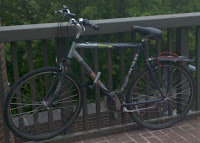
Yesterday we rode down Ithaca's hills in an attempt to estimate the terminal velocity of a bike rider braving the city's potholes. But estimations are easy, and we relied on a number of factors - the drag coefficient and area of the bicyclist, in particular - to get them. To see how well we did, it's time to move on to the experimental portion this exercise. Our tools? My bike (figure 1), and my beloved accelerometer (figure 2), with Google's My Tracks app installed.
Figure 2: Our instrumentation
I took data twelve times while driving down two paths (University avenue and State street), measuring both the speed and elevation as a function of time. I came up with a lot of noisy data, some of it useful and a lot of it not. A typical plot out of the software looks something like (figure 3); out of those I identified moments of what seemed to be free acceleration, where I was not applying the brakes. I then calculated the slope and the acceleration at each point by subtracting subsequent measurements; this resulted in much noisier data, as seen on (figure 4).
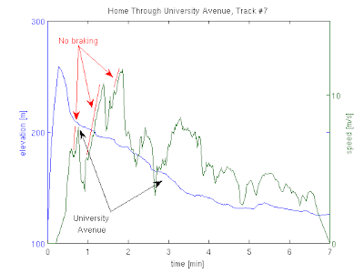 Figure
3: Typical data riding downhill
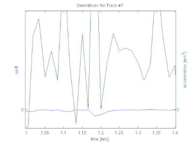 Figure
4: Derivatives
The next question was what to fit these graphs to. I can't compare directly to the formula I had for terminal velocity, since I don't believe I achieve it at any point and we never see the velocity graph plateau. What we do have is the formula for the acceleration, which depends on both the angle and the velocity: $$ a = g\sin\theta - \frac{1}{2}\frac{\rho A C_d}{m} v^2. $$ It's a little hard to plot three-dimensional surfaces like this, but I can try to plot the acceleration as a function of the velocity squared. Assuming that the slope of each of my routes is constant and that they are both different, this should give me two straight lines offset by a constant. Seen in (figure 5), this yields less than optimal result. A first correction would be to account for the differing slope at different measurement points. Once we do that the data looks a little more linear, and we can fit a line through it, as seen in (figure 6).
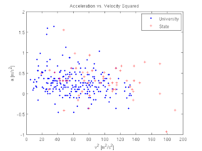 Figure
5: Acceleration vs. velocity
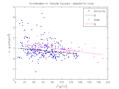 Figure
6: Adjusted for slope and fitted
The fits are given by: $$ a = (1.022 \rm{m}) - (0.00427 \rm{1/m}) v^2\;\; \rm{(University)} $$ $$ a = (1.465 \rm{m}) - (0.00572 \rm{1/m}) v^2\;\; \rm{(State)} $$ and we can quickly extract the terminal velocity out of the coefficients to get a factor of 47.9 m/s for the first line and 41.4 m/s for the second. These both fall within 20% of our initial estimate, which is quite satisfying considering how bad the data looks. A few final thoughts:
- Why is the data so noisy? I can think of a lot of reasons. My Droid phone is not quite a scientific measuring device to begin with, and we did some numerical derivation of the initial data we got from it. On top of that, the way I sit on the bike, the weight of the bag I carry with me and other factors like the wind changed from ride to ride.
- I tried to avoid biasing the analysis and I was quite relieved when the final numbers came out so close to my original estimate. I did play around a little with a different presentation that didn't look linear at all, but other than that I think what I did was pretty straightforward.
- The one thing that I don't like about the final results is the constant addition to both acceleration fits, or put another way, the fact that after subtracting the gravitational pull from the acceleration I still get positive numbers, while the drag force should work to reduce it. I suspect this implies that my cancellation of the sinθ term was less than perfect.
- Can you figure out what the trajectory the bike as a function of time looks like? There's a (non-trivial) analytic expression.

Comments
Comments powered by Disqus