Free data set of the month: Imaging Spectroscopy
There's a lot of free data sets floating around the internet, and while things like funny cat videos and the results of color-naming surveys get a lot of play, many others don't get used for much. Recently I've been playing around with one such data set: images from the Airborne Visible/Infrared Imaging Spectrometer (AVIRIS).
I've always found it interesting that the way we perceive color is very different from how light actually works. Most of us have three different types of cones in our eyes and we perceive different colors as different combinations of stimuli to these three types of cones. In a very rough sense, when we look at a color, our brain gets three different numbers to figure out what it is. Light, on the other hand, is a bunch of photons with some distribution of wavelengths. To fully describe the light coming from an object you need a function that shows how many photons are at any given wavelength, which is way more complicated than just the three numbers we get.
So what about all that information that gets thrown away on the way to our brain? Are we missing out on a magical world of super-duper colors and wonder? Not really, but skip past the break anyways to find out more.
There are a few things our eyes have a hard time distinguishing. For example, take a look at this picture of a low-pressure sodium lamp:
If you've ever been in a sketchy parking lot at night or an intro physics class you've probably seen one of these in real life. It looks just like the picture right? It does to us, but the light coming from the picture and the light from the real lamp are totally different. All the photons from the real lamp have wavelengths very close to 589 nanometers, while the ones coming from the picture on your screen have a bunch of different wavelengths ranging from 500 to 700 nanometers, depending on what type of monitor you have. (It's easy to build your own spectrometer and see this for yourself.)
 This
is an extreme example since there are few objects that emit purely
monochromatic light. What do normal objects look like spectroscopically?
I wanted to find out, but unfortunately there's not too many
freely-available spectroscopic images of everyday objects floating
around the internet, and my attempts to make my own were stymied by the
fact that no one wanted to let me borrow $20,000 worth of optical
bandpass filters. However, there are a several orbital satellites and
planes which take spectroscopic images of the earth, and one of them,
AVIRIS, has a few sample data sets for people to play around with. I
recently wrote some code to help me look at one data set in particular –
a spectroscopic image of Moffett Federal
Airfield in
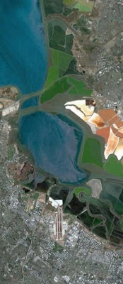
California, shown here in a normal picture from Google Earth.
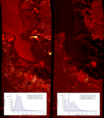
AVIRIS acts much like a normal camera, but instead of three wide-band filters for distinguishing color it uses 225 narrow bands ranging from 366 nanometers (near UV) to 2500 nanometers (near IR). Any of these bands can be thought of as a single monochromatic image. Here I have plotted two bands side by side for comparison. The right image is at 463 nanometers (a nice blue color) and the other is at 2268 nanometers, well into the infrared. (Both images are false-colored to enhance the contrast).
The scene looks a lot different at the two different wavelengths. In the first image there's one area that's particularly bright – it is one of several settling ponds belonging to a Morton Salt factory, although I have no idea what is special about this one that makes it reflect blue light so strongly. The second image highlights different features and clearly shows the difference between the moving water in the creeks and the standing water in the bay.
These are just two of the bands, but you can see all of them fly by in the movie below. (Note that the color scale is set for each band individually, which is why there sometimes seems to be a large change between adjacent bands).
If you agree with me that the embedded video looks super-crappy you can download the original here (6.4 MB).
One of the things that struck me about this video is that it seems like much of the image doesn't change too much through the whole visual range. Not surprisingly, it's a lot easier for us to distinguish between the slight differences in color in a normal image than it is for us to distinguish between the slight changes of intensity here.
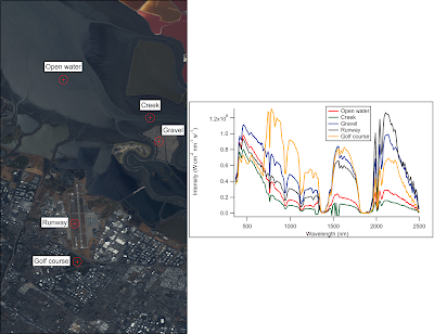
So what do the spectra of individual points in the image look like? Let's focus on a few easily-identifiable objects. (I'll talk about how I made the roughly-true color image below in a later post).
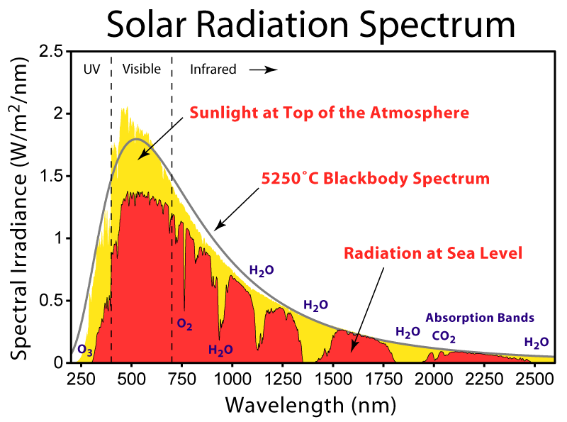
The first thing that stands out is that there's a lot of features that are common to all of the locations, such as the big gap near 1750 nanometers. While the sun sends photons with a distribution of wavelengths roughly described by Planck's Law, certain wavelengths are strongly absorbed by gasses in the atmosphere as shown below:
Looking at the different spectra we can see that liquid water absorbs strongly in the infrared, and the green grass on the golf course reflects strongly in the near-infrared (no clue why). There is also a clear difference in intensities for each of the locations in the visual range, but the five locations otherwise look quite similar, even though they are very different colors in real life.
I'll look at a few more interesting things in this data set and talk a bit about about how our eyes and brains process color in a later post.


Comments
Comments powered by Disqus